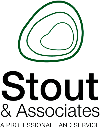

Stout & Associates
Identity design for a land services firm. The concept for this logo was based on topographical maps commonly used within the industry. The simplified topographical element, paired with the use of Helvetica, create a clear mark which stands apart amongst others in this industry.
Return to thumbnails